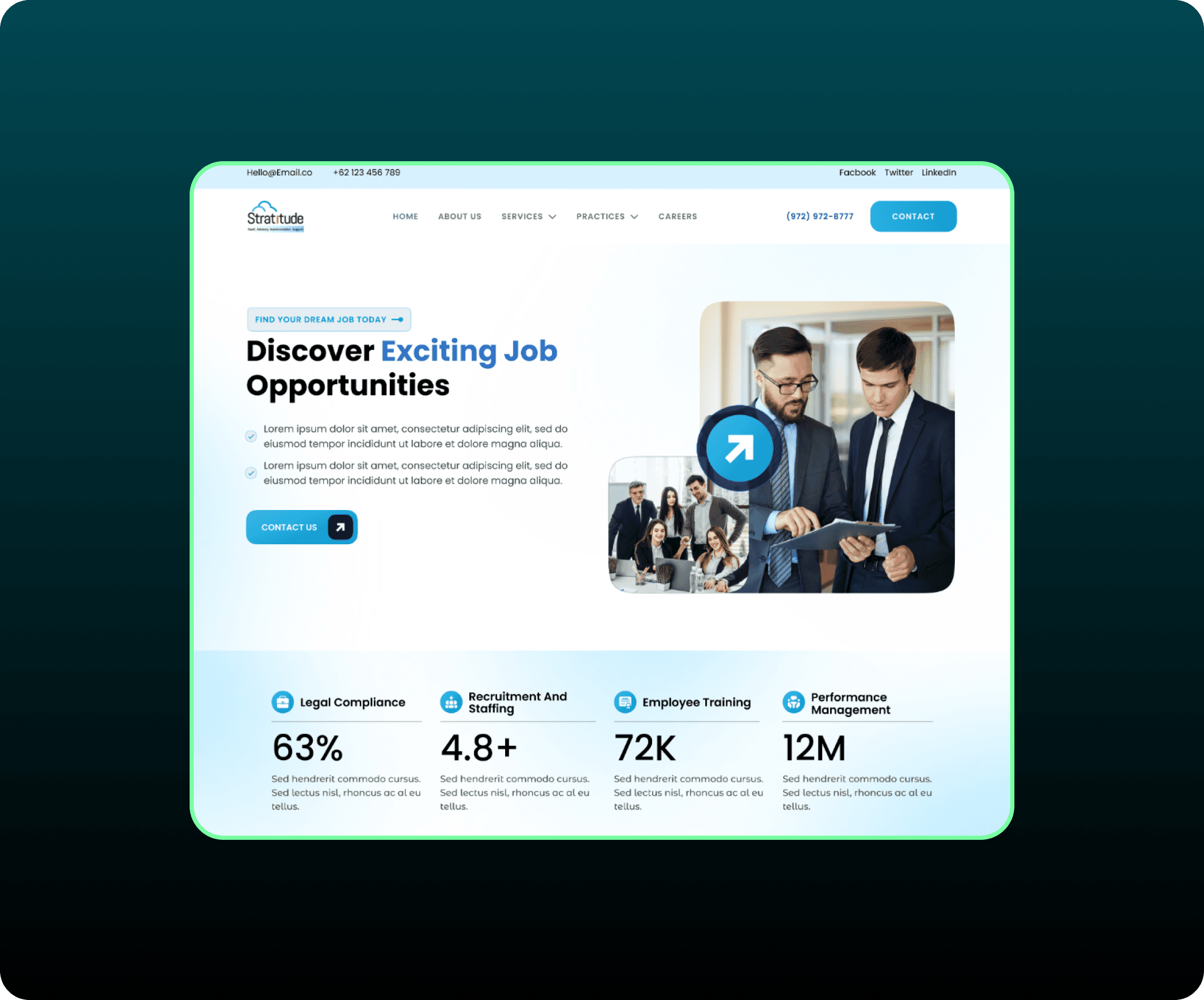
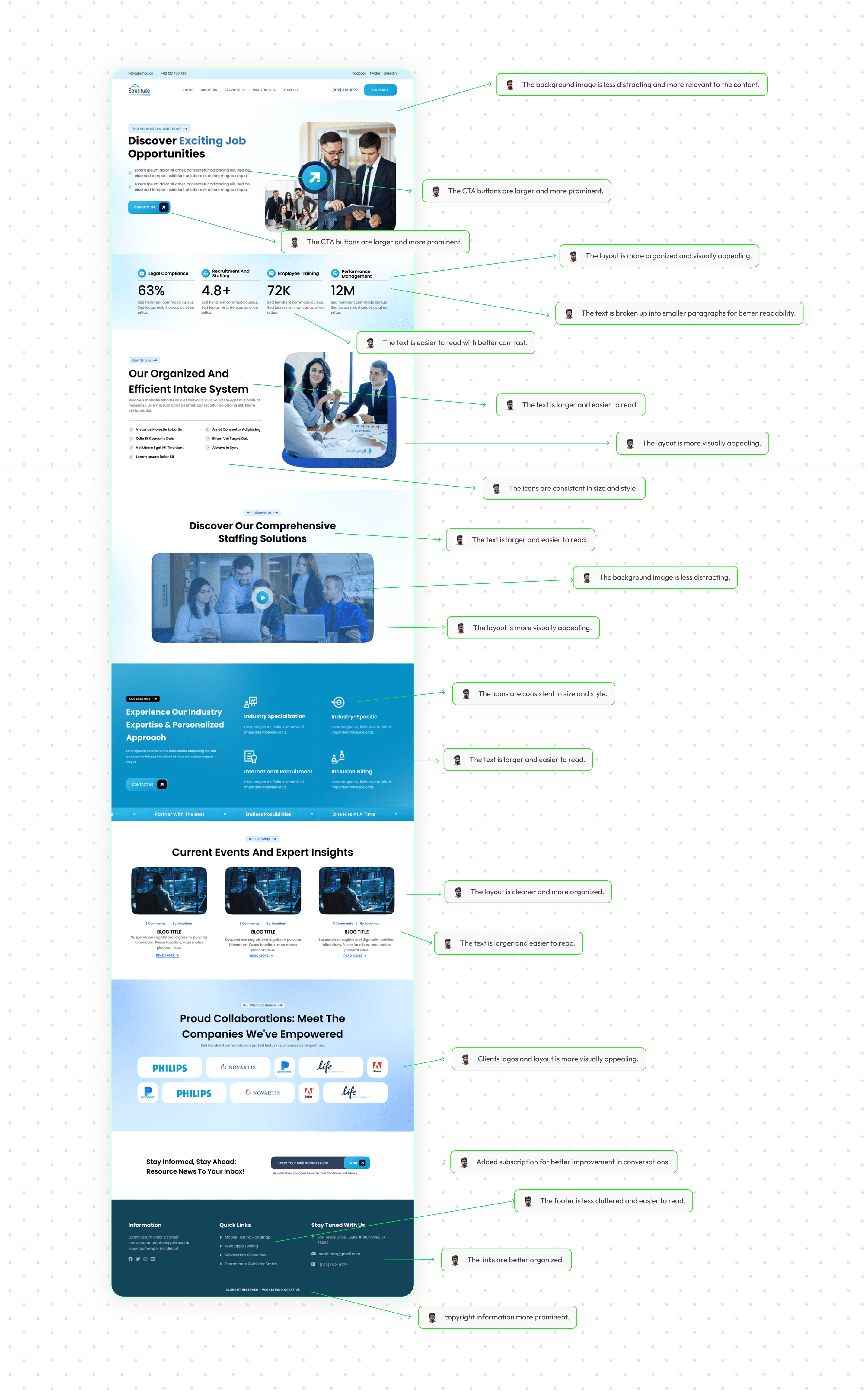
Revamping Our Digital Presence: A Website Redesign Journey
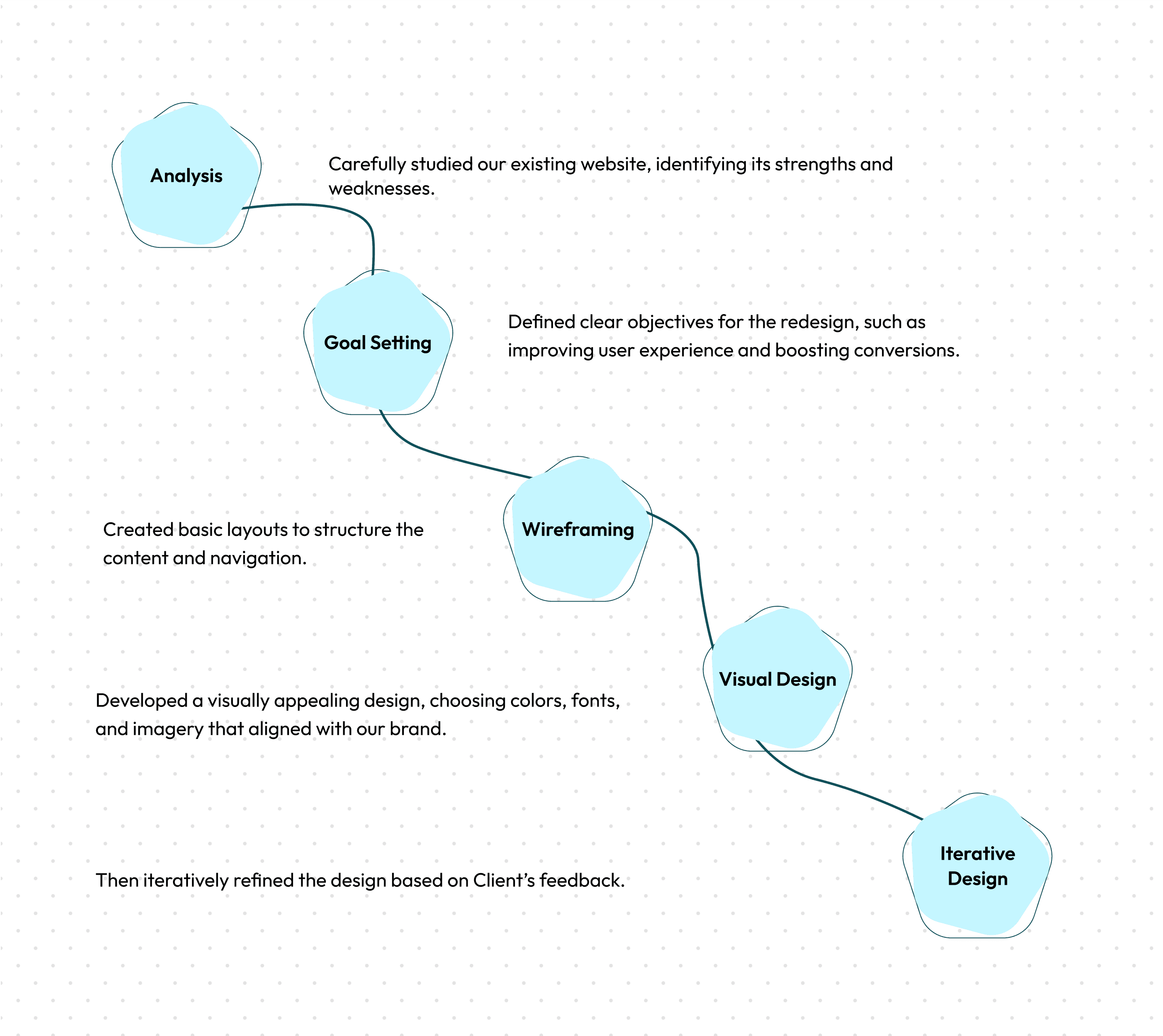
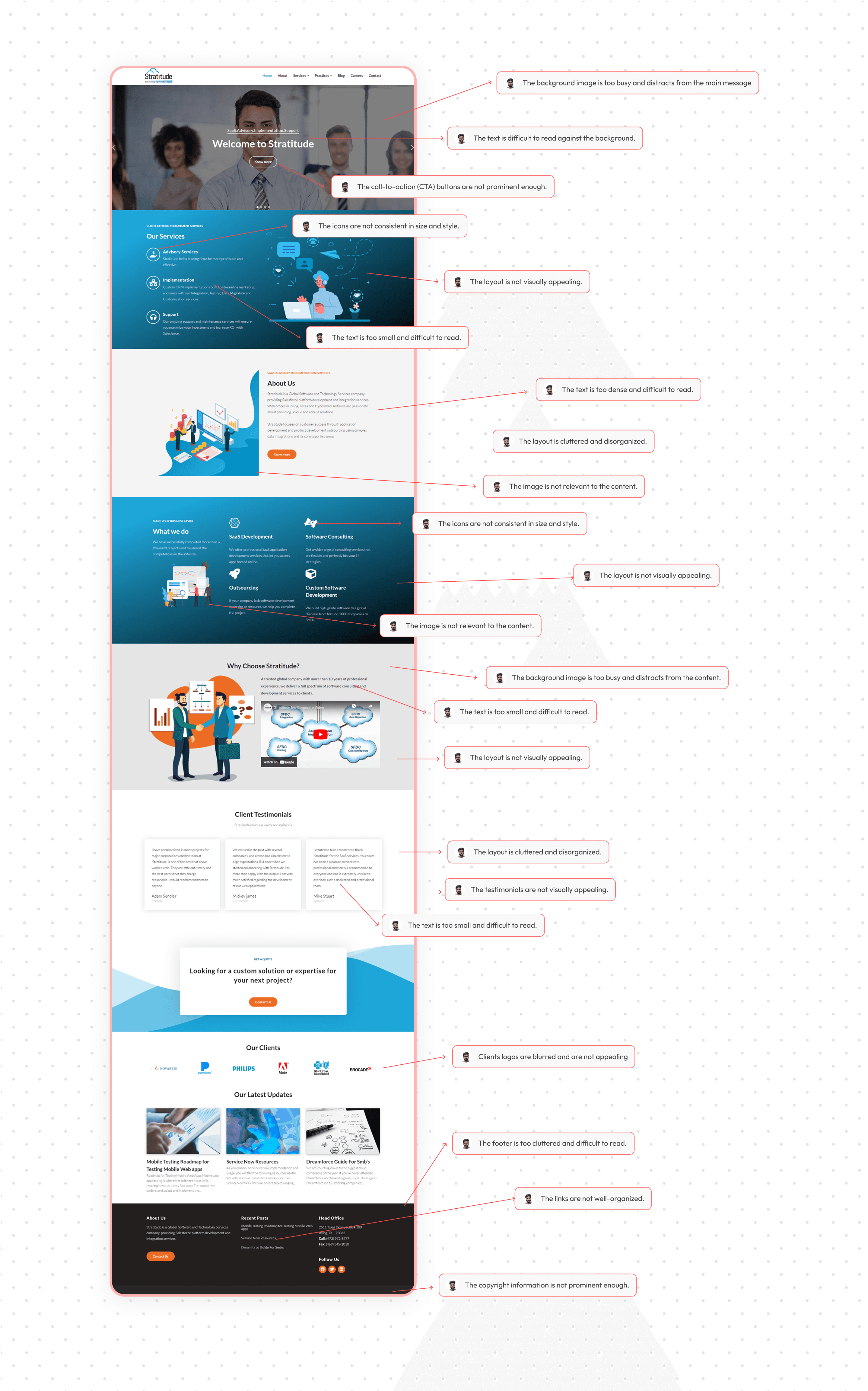
I redesigned our website to improve its look and feel, make it easier to use, and better reflect our brand. We analyzed the old design, set clear goals, created visual mockups, designed the website.
Role
UX Designer
Industry
It Staffing
Duration
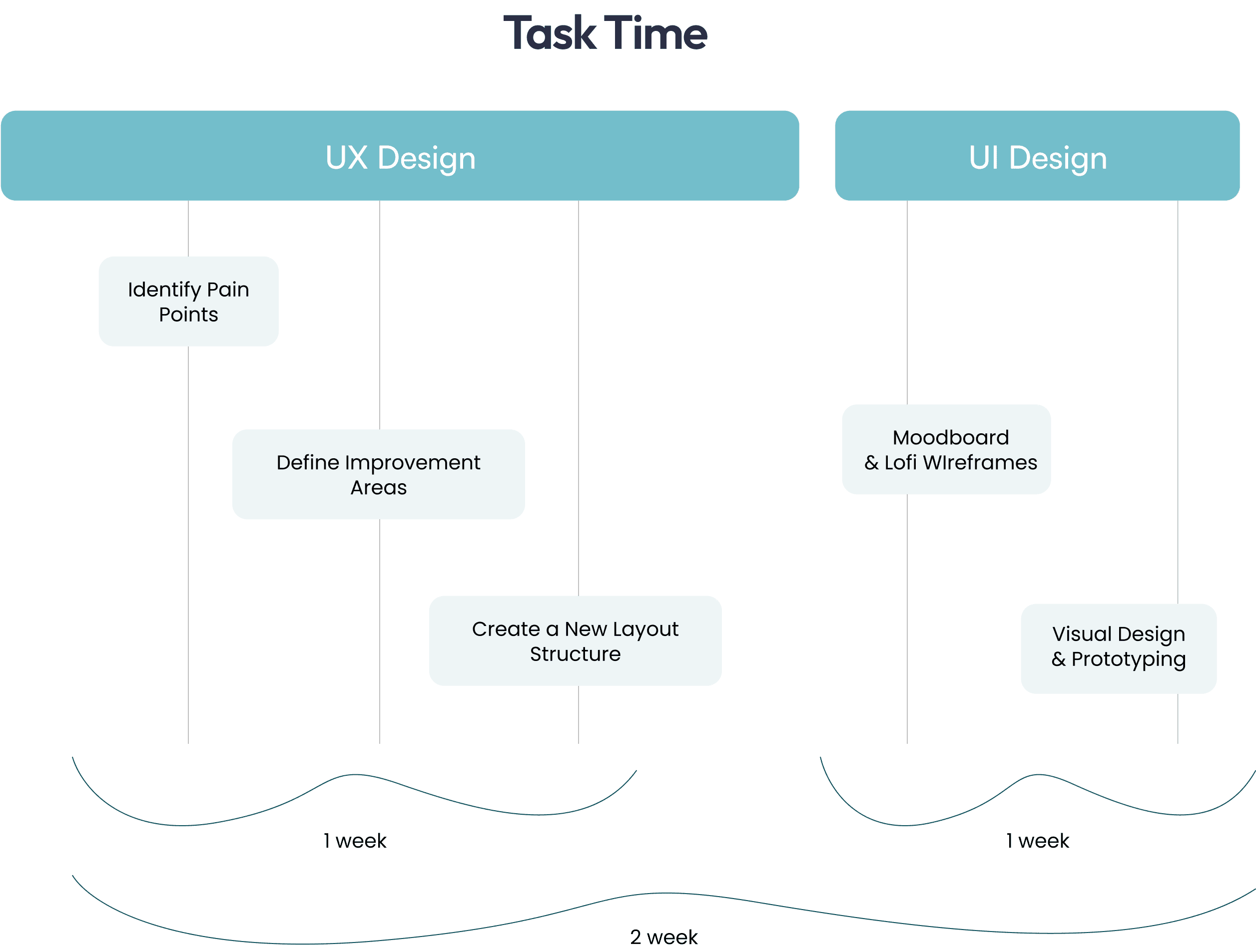
3 weeks

Other projects
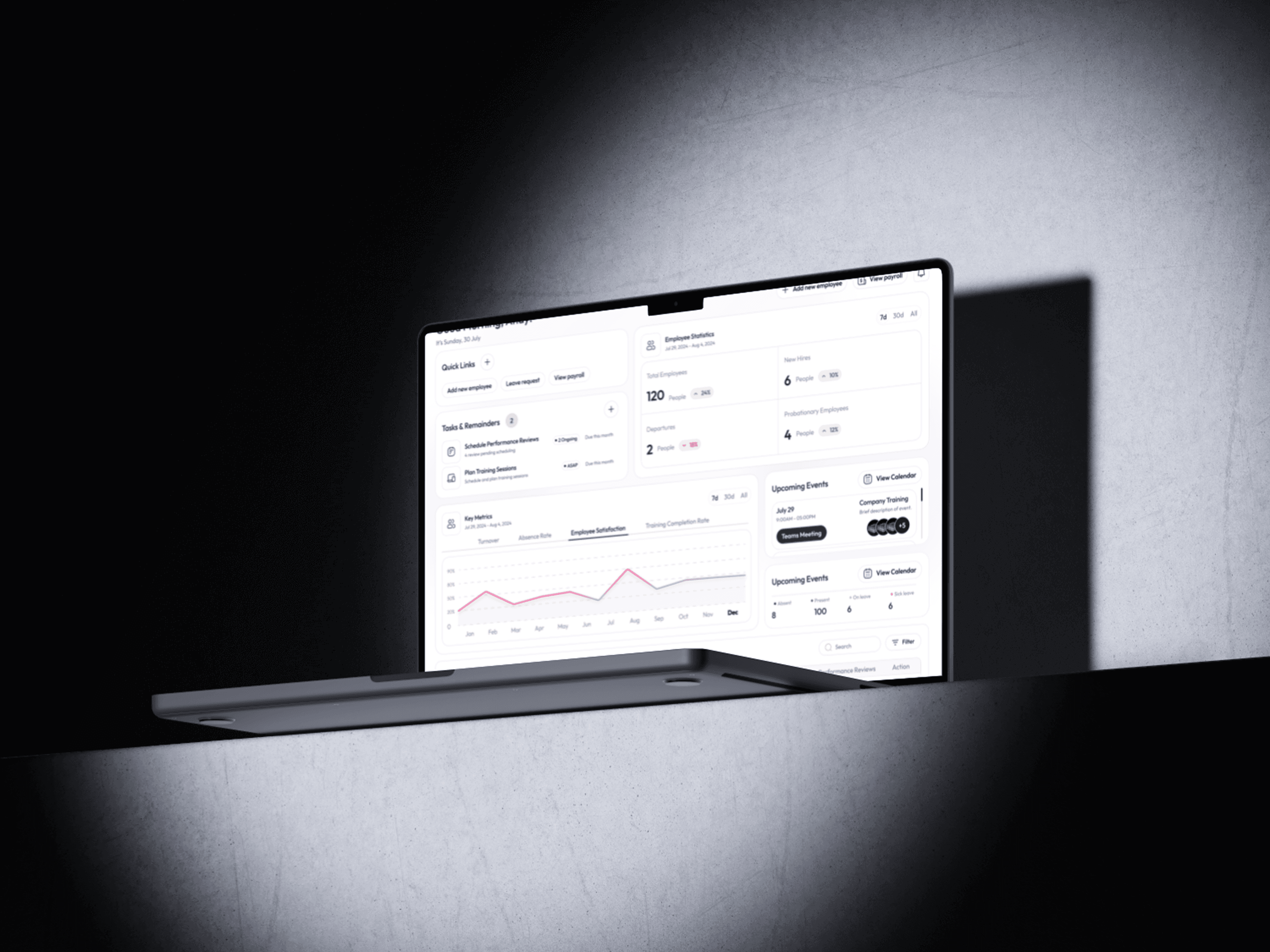
Redesign project: CRM portal
Elevating the user experience of a renowned CRM portal through a strategic approach.
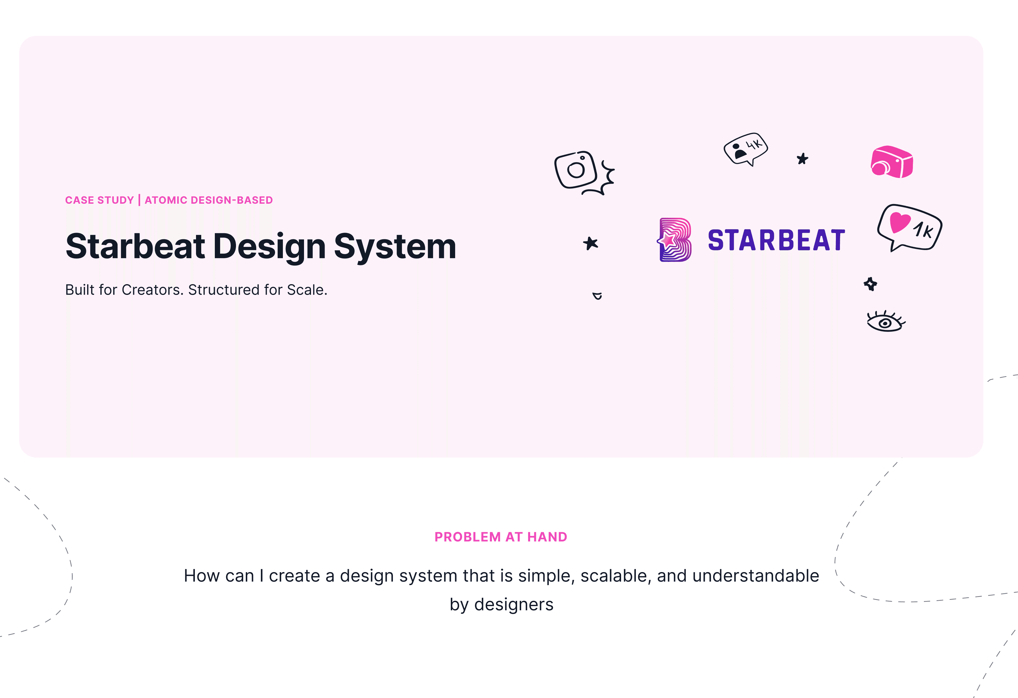
Strabeat Design System
Starbeat Design System is a scalable, creator-first UI framework built with Atomic Design. It ensures consistency, speed, and flexibility across web and mobile platforms.
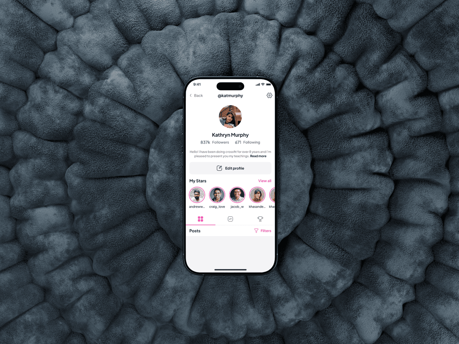
Starbeat iOS App Redesign Case Study
Designing a mobile app to connect Influencers and dans through shared platform, from concept to prototype.
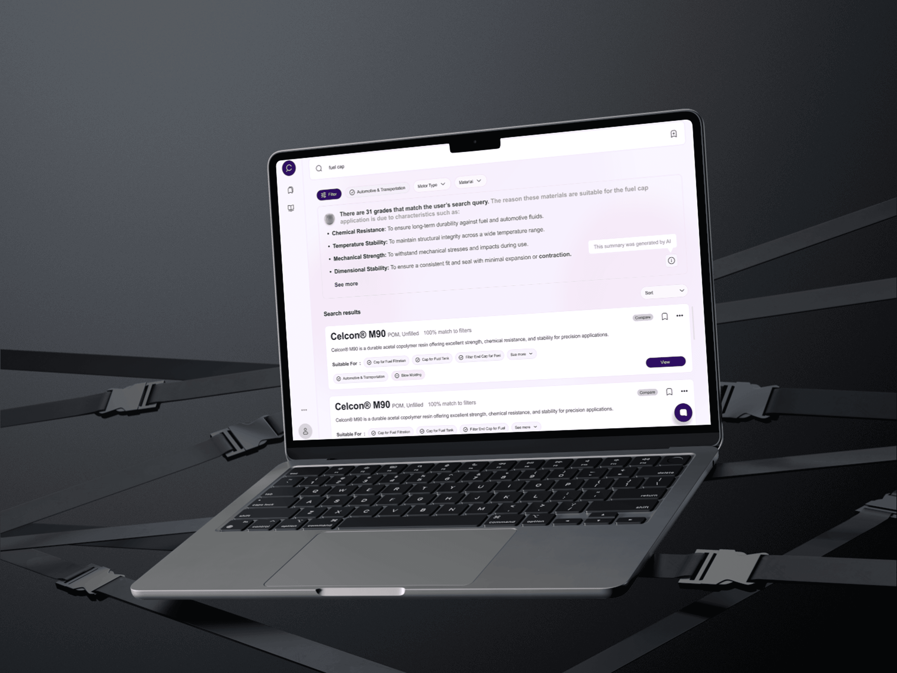
User-friendly generative AI interface
Revolutionizing intuitive interface that offers contextual advice, product comparisons, and a dynamic, user-friendly experience.