Redesign project: CRM portal
Elevating the user experience of a renowned CRM portal through a strategic approach.
Role
UX/UI Designer
Industry
IT solutions
Duration
3 months
About Project
During my time at SBase Technologies, we took on a project to redesign the Synergy CRM Portal, a platform regularly used by businesses. The primary objective was to enhance the user experience by making the interface more intuitive, modern, and efficient.
In this case study, I will walk through my approach, the design process, the challenges faced, and how I overcame them. This project was not only one of the most challenging but also one of my favorites.
Collaboration & Key Stakeholders
Product Manager – Helped define the project scope, requirements, and constraints while providing valuable feedback on the design direction.
Engineers – Helped me understand technical limitations and feasibility within the project scope.
This collaborative effort ensured the successful transformation of the Synergy CRM Portal into a seamless and user-friendly experience for brokers.
Why Redesign?
The Problem Statement
The current version of their pages had many issues. They are old and outdated, but that’s not the only problem. It went way deep when we first analyzed their screens.
Here are some of my observations:
Lack of hierarchy.
It was visually cluttered.
No proper filtration of information.
User flow was bad—lots of clicks and struggle to complete a task.
UI looks bad and out of place.
No feedback and improper messaging.
It surely needed a makeover with a modern approach.
Let’s start the show
Research
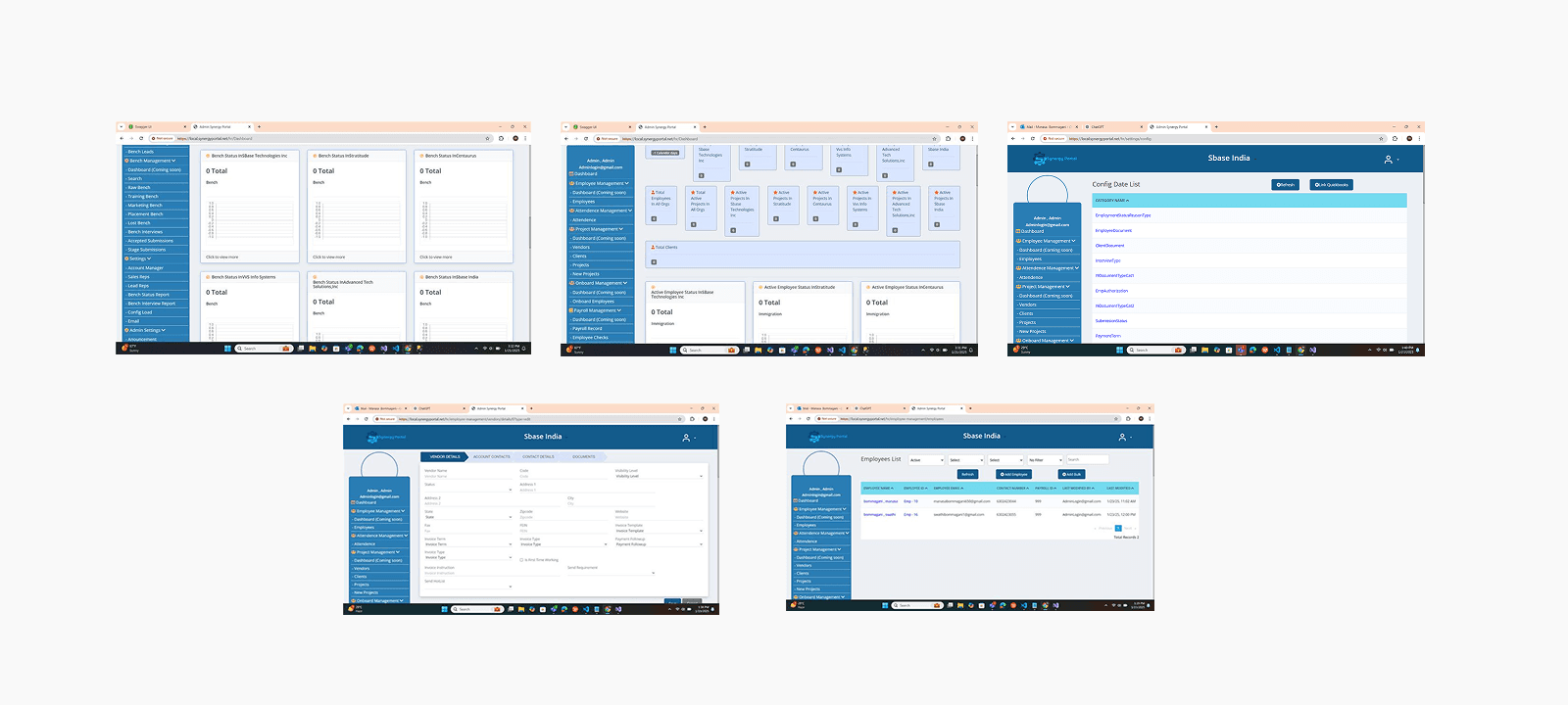
The major challenge I had was the lack of information provided by Synergy. I wasn’t allowed to get my hands on their existing product to test due to security reasons. Neither they allowed us to take user interviews and surveys of their brokers — for whom the product redesign was to be done. And because of that, primary research becomes impossible to do. The only thing that was provided to us was screenshots of their exciting product. This was the major constraint and limitation I had while doing my research.
Below are some of the screenshots provided by them
In order to gain some perspective, I did a lot of secondary research to understand the mechanics of admin portals and best practices in the industry for better output. I also researched the industry to gain basic information about the market and also relied a lot on feedback from the Product Manager of Synergy.
I started gathering Inspiration from different platforms and analyzed how the visual hierarchy works, and what makes User-Friendly Interface, identified some patterns, and understood the importance of Real-Time Monitoring in the Insurance industry.
A few of the observations for designing the admin/dashboard portal for this project are:
Consistency.
Keeping it simple and focused.
Data Hierarchy.
Flexibility.
Minimize user input.
Consider Accessibility.
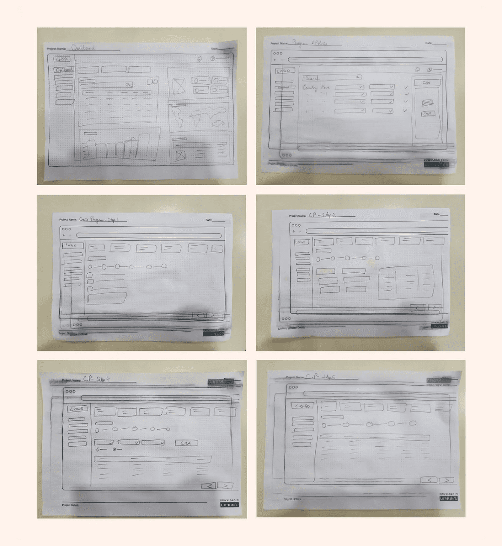
Wireframes
I sketched out some options for how I could improve the existing design and resolve the above-mentioned problems.
Designs
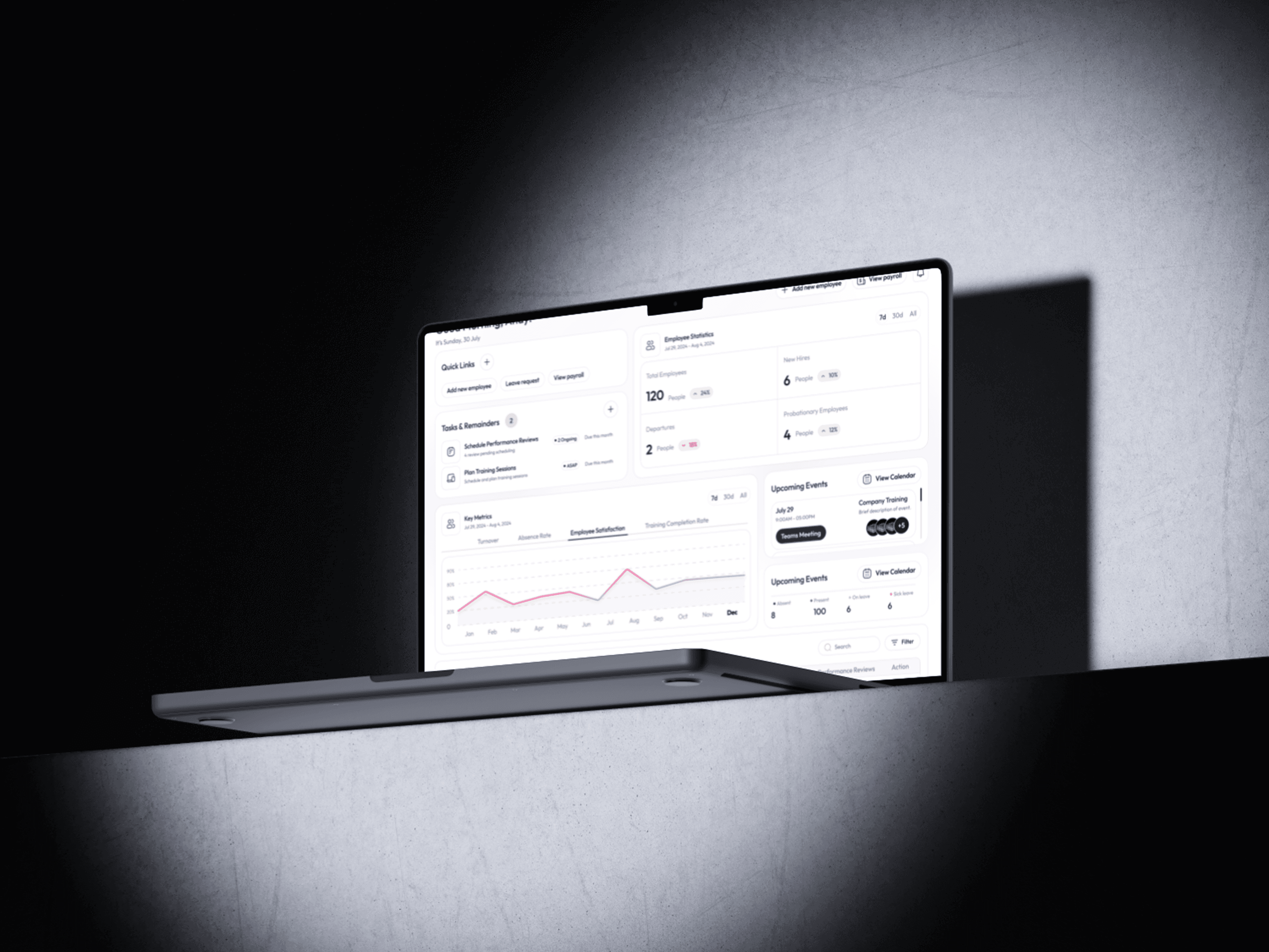
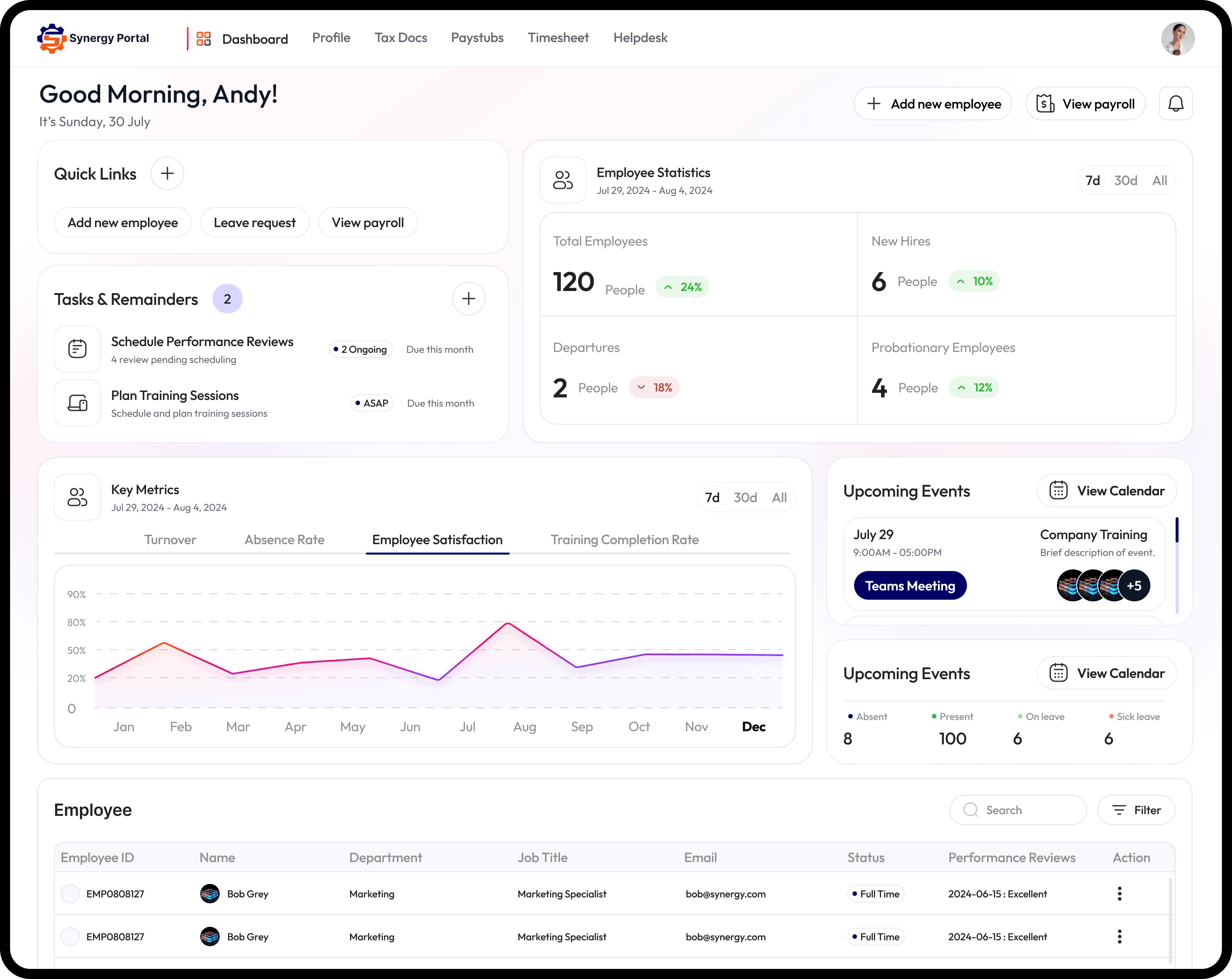
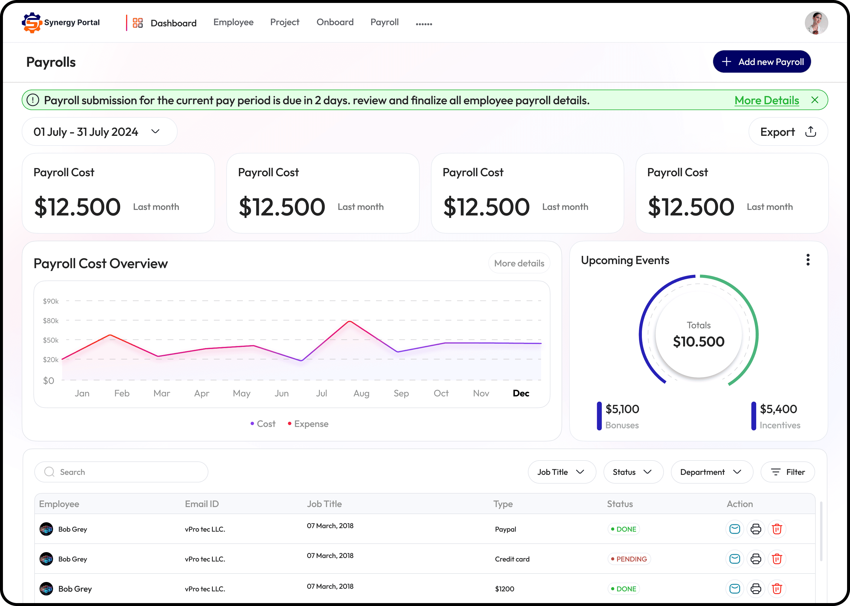
Superstar of admin pages aka Dashboard
Their initial version doesn’t have a dashboard and because of that, the information was scattered around the portal. We decided to create one from scratch.
The dashboard is very crucial for a project like this because it provides the following benefits:
Real-Time Monitoring.
Data Visualization.
Efficient Decision-Making.
Identification of patterns.
Forecasting and prediction.
As I mentioned earlier that I was not allowed to have a look at their exciting product; it required endless research and a lot of meetings with the PM to understand the most important features of their product and how often they were used by their users.
Eventually, the hard work pays off and after a lot of iterations, the design started to shape up.
And followed by some other pages designs..
Reflection and Key Takeaways
This project was a roller-coaster ride for me, from Excel screenshots to not being able to do primary research I worked with lots of constraints and banged my head countlessly. But I enjoyed it a lot, my PM was an absolute gem and encouraged me with lots of ideas and suggestions during the project.
Learnings
Learned how to work with lots of constraints and limitations.
Small changes can make a huge impact on the whole user experience of the product.
Understood the importance of interaction in design.
How to use a design system to maintain consistency in the design.
Learned how to prioritize information based on its importance and hierarchy.
Learned how to make things easier for users and reduce friction to enhance user efficiency.
I changed my design process and learned that every project presents its own unique challenges.
I gained the confidence to approach any problem with logical reasoning.
About Project
During my time at SBase Technologies, we took on a project to redesign the Synergy CRM Portal, a platform regularly used by businesses. The primary objective was to enhance the user experience by making the interface more intuitive, modern, and efficient.
In this case study, I will walk through my approach, the design process, the challenges faced, and how I overcame them. This project was not only one of the most challenging but also one of my favorites.
Collaboration & Key Stakeholders
Product Manager – Helped define the project scope, requirements, and constraints while providing valuable feedback on the design direction.
Engineers – Helped me understand technical limitations and feasibility within the project scope.
This collaborative effort ensured the successful transformation of the Synergy CRM Portal into a seamless and user-friendly experience for brokers.
Why Redesign?
The Problem Statement
The current version of their pages had many issues. They are old and outdated, but that’s not the only problem. It went way deep when we first analyzed their screens.
Here are some of my observations:
Lack of hierarchy.
It was visually cluttered.
No proper filtration of information.
User flow was bad—lots of clicks and struggle to complete a task.
UI looks bad and out of place.
No feedback and improper messaging.
It surely needed a makeover with a modern approach.
Let’s start the show
Research
The major challenge I had was the lack of information provided by Synergy. I wasn’t allowed to get my hands on their existing product to test due to security reasons. Neither they allowed us to take user interviews and surveys of their brokers — for whom the product redesign was to be done. And because of that, primary research becomes impossible to do. The only thing that was provided to us was screenshots of their exciting product. This was the major constraint and limitation I had while doing my research.
Below are some of the screenshots provided by them
In order to gain some perspective, I did a lot of secondary research to understand the mechanics of admin portals and best practices in the industry for better output. I also researched the industry to gain basic information about the market and also relied a lot on feedback from the Product Manager of Synergy.
I started gathering Inspiration from different platforms and analyzed how the visual hierarchy works, and what makes User-Friendly Interface, identified some patterns, and understood the importance of Real-Time Monitoring in the Insurance industry.
A few of the observations for designing the admin/dashboard portal for this project are:
Consistency.
Keeping it simple and focused.
Data Hierarchy.
Flexibility.
Minimize user input.
Consider Accessibility.
Wireframes
I sketched out some options for how I could improve the existing design and resolve the above-mentioned problems.
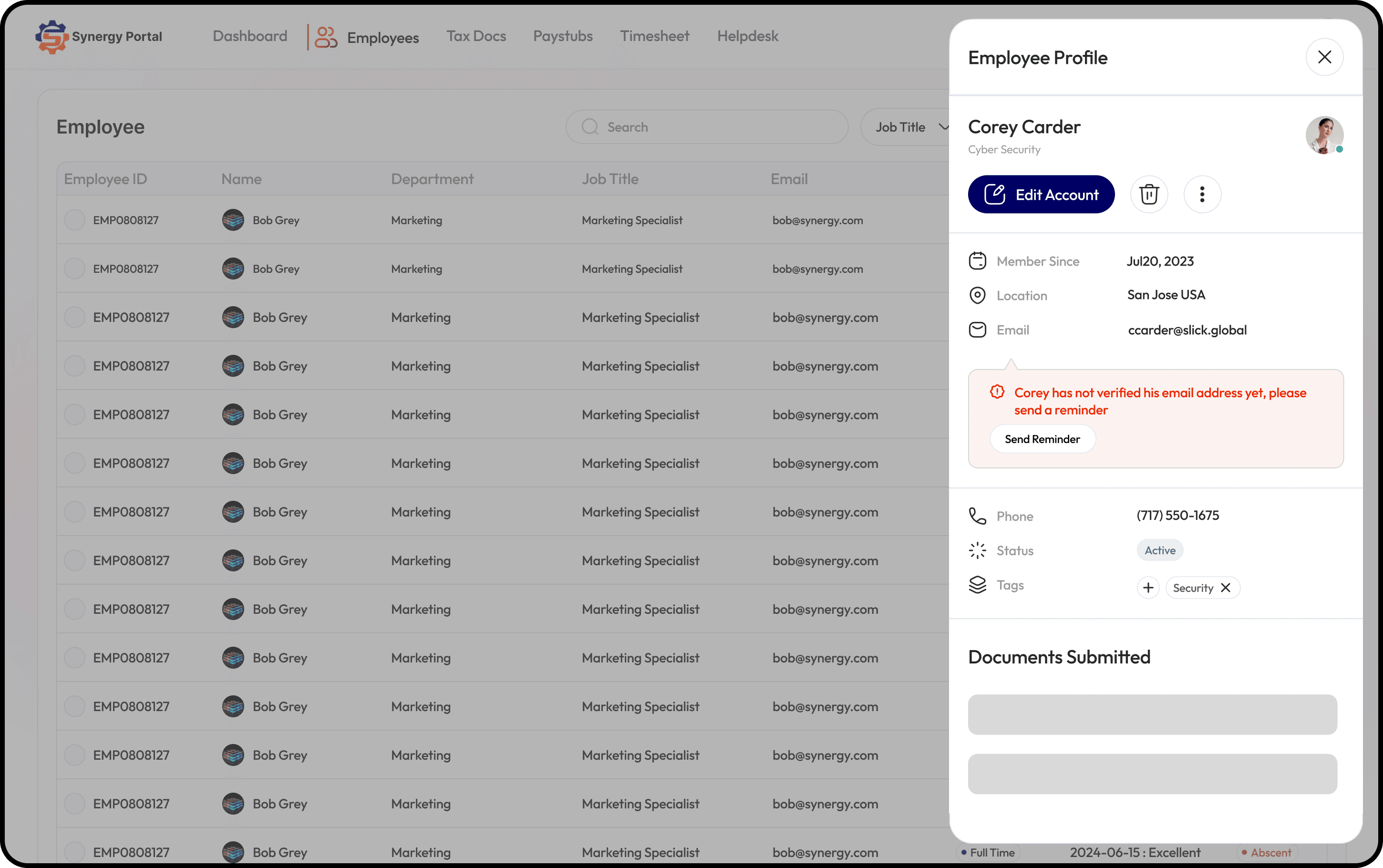
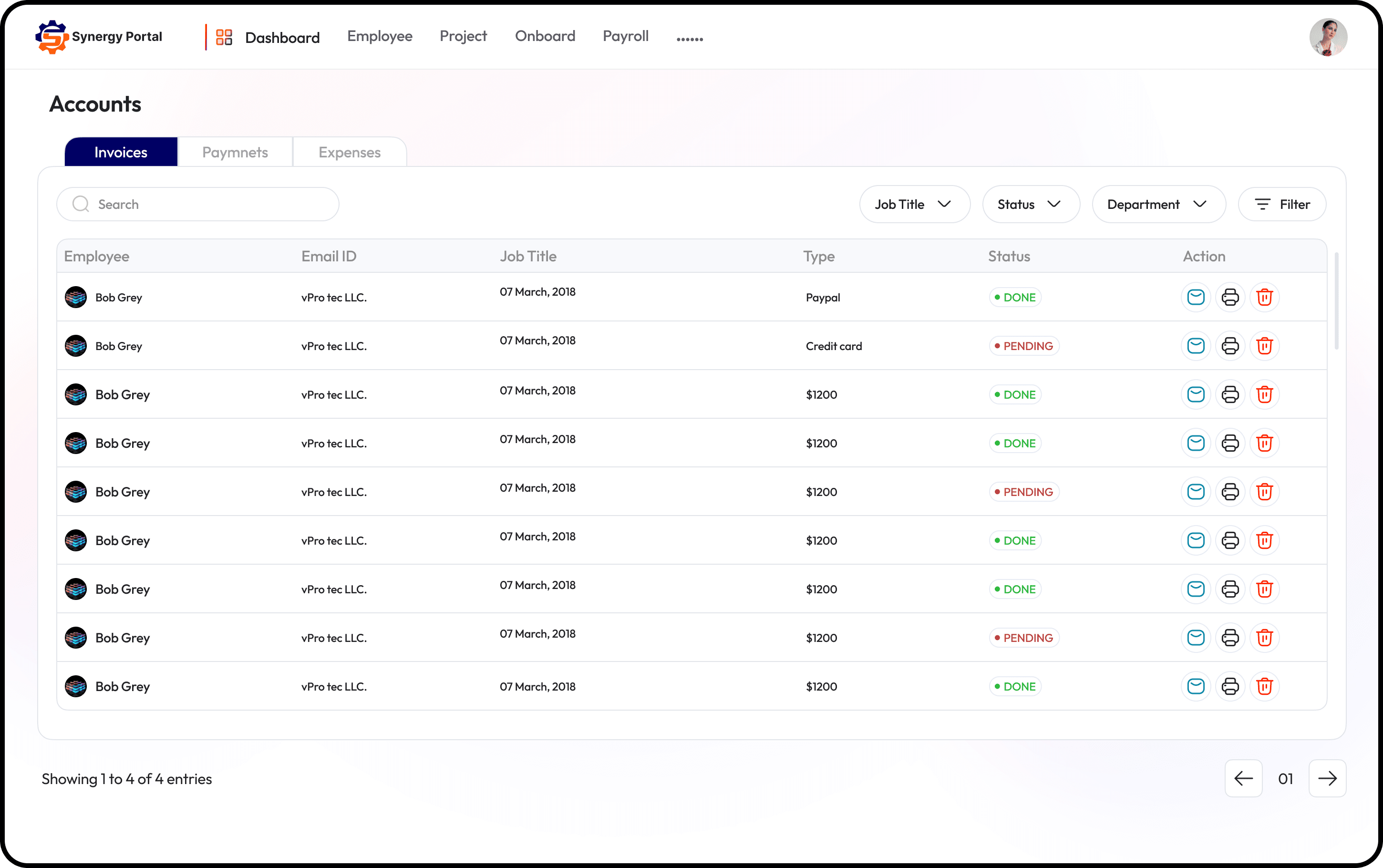
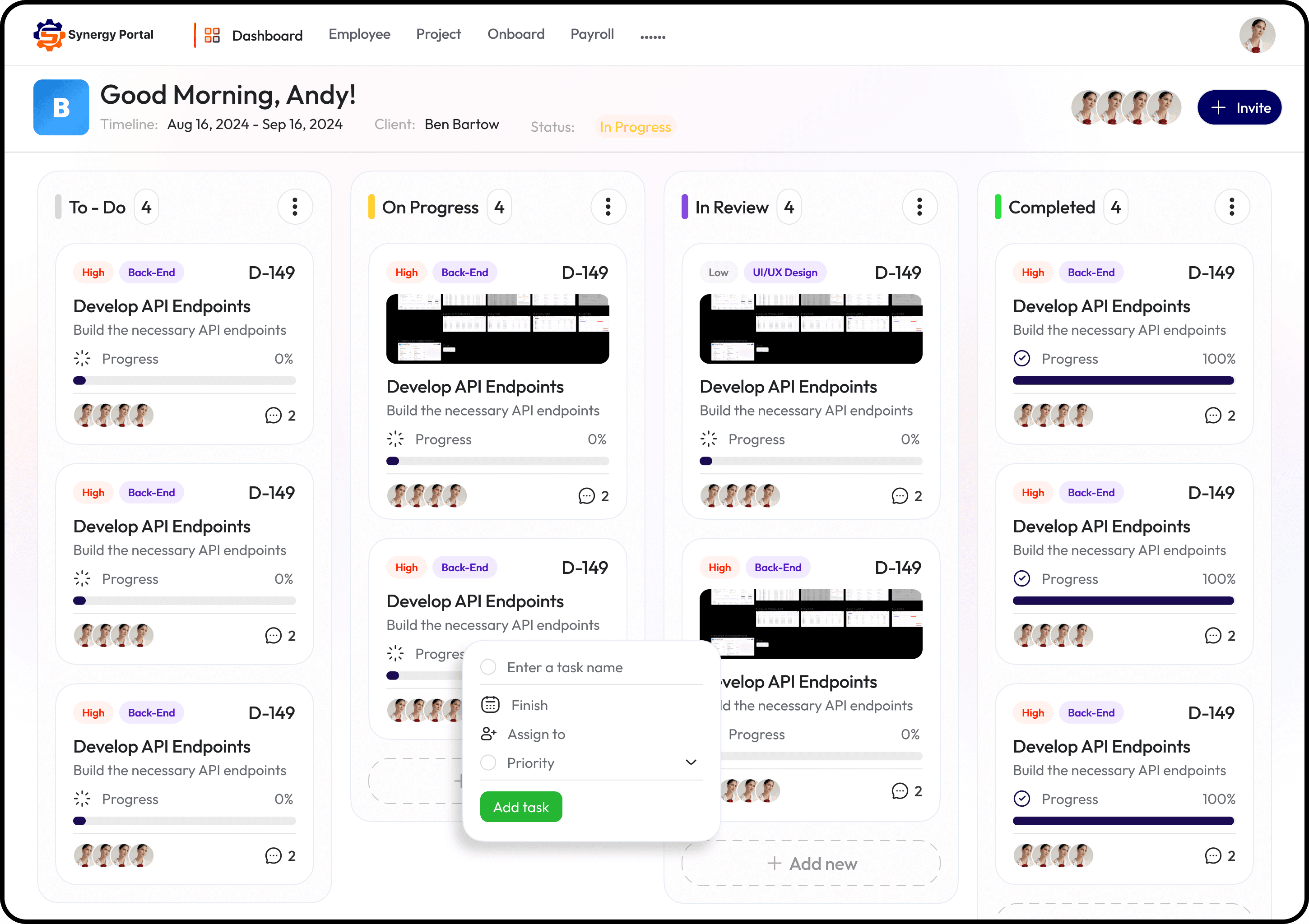
Designs
Superstar of admin pages aka Dashboard
Their initial version doesn’t have a dashboard and because of that, the information was scattered around the portal. We decided to create one from scratch.
The dashboard is very crucial for a project like this because it provides the following benefits:
Real-Time Monitoring.
Data Visualization.
Efficient Decision-Making.
Identification of patterns.
Forecasting and prediction.
As I mentioned earlier that I was not allowed to have a look at their exciting product; it required endless research and a lot of meetings with the PM to understand the most important features of their product and how often they were used by their users.
Eventually, the hard work pays off and after a lot of iterations, the design started to shape up.
And followed by some other pages designs..
Reflection and Key Takeaways
This project was a roller-coaster ride for me, from Excel screenshots to not being able to do primary research I worked with lots of constraints and banged my head countlessly. But I enjoyed it a lot, my PM was an absolute gem and encouraged me with lots of ideas and suggestions during the project.
Learnings
Learned how to work with lots of constraints and limitations.
Small changes can make a huge impact on the whole user experience of the product.
Understood the importance of interaction in design.
How to use a design system to maintain consistency in the design.
Learned how to prioritize information based on its importance and hierarchy.
Learned how to make things easier for users and reduce friction to enhance user efficiency.
I changed my design process and learned that every project presents its own unique challenges.
I gained the confidence to approach any problem with logical reasoning.
Other projects
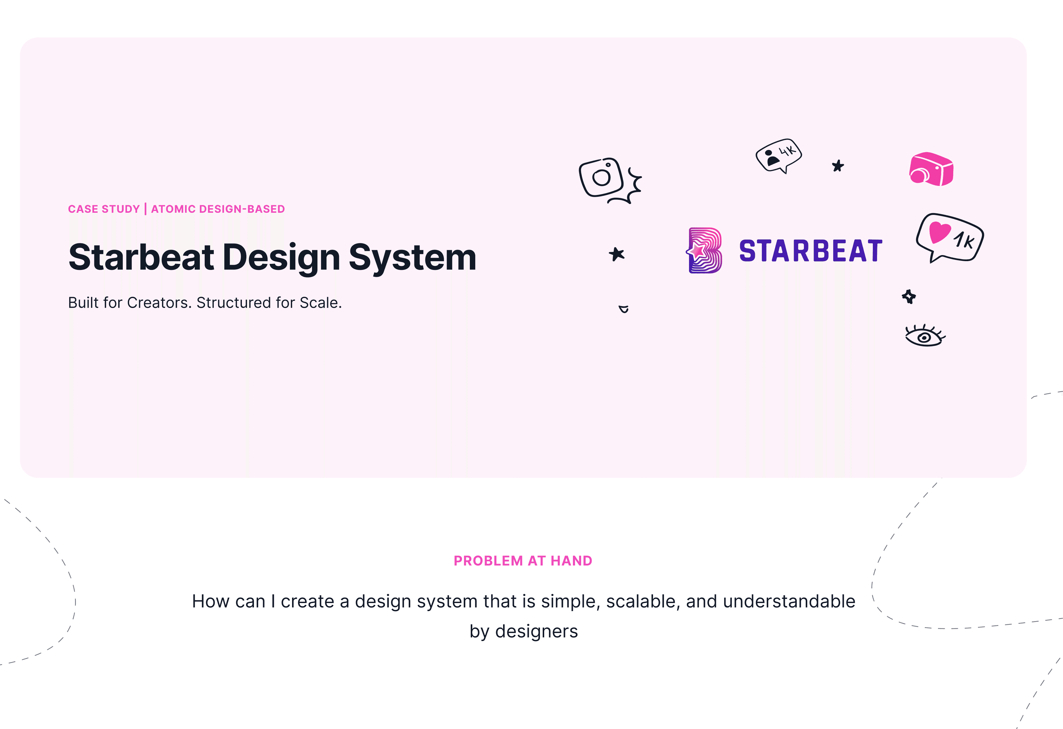
Strabeat Design System
Starbeat Design System is a scalable, creator-first UI framework built with Atomic Design. It ensures consistency, speed, and flexibility across web and mobile platforms.
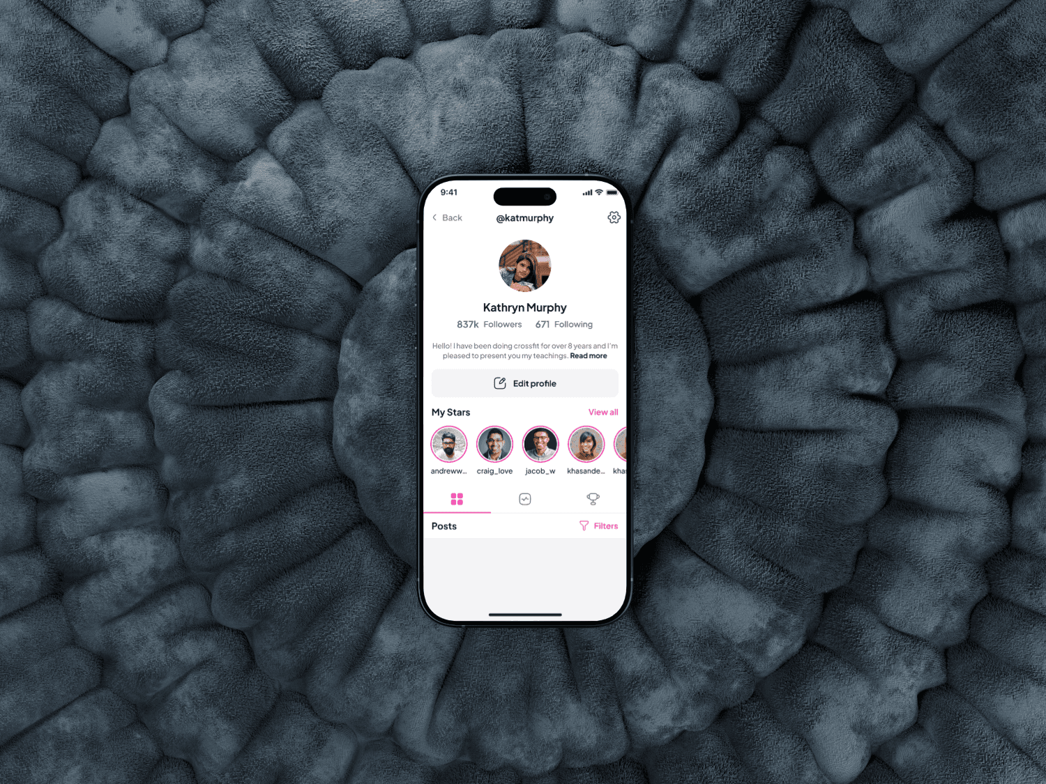
Starbeat iOS App Redesign Case Study
Designing a mobile app to connect Influencers and dans through shared platform, from concept to prototype.
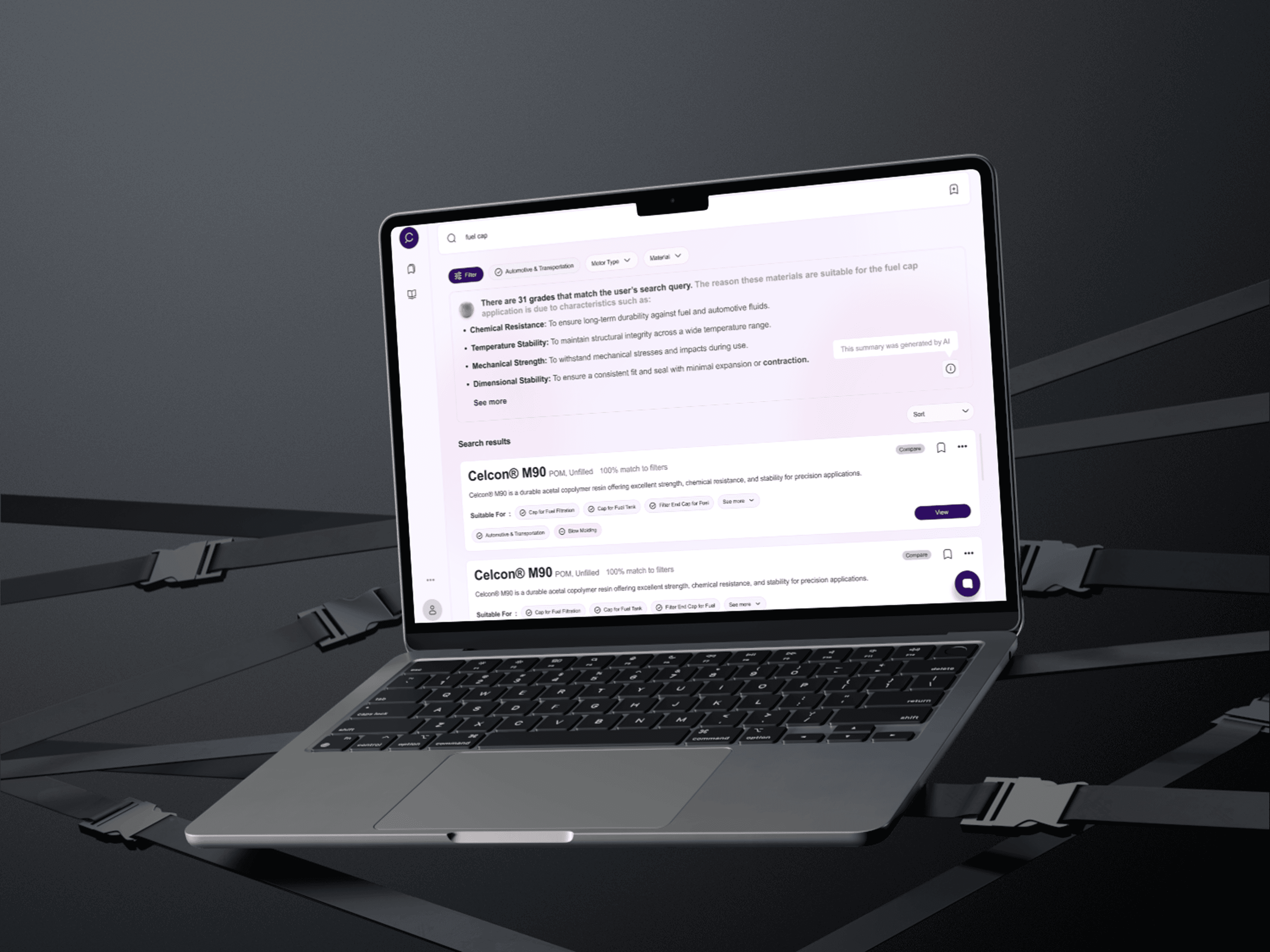
User-friendly generative AI interface
Revolutionizing intuitive interface that offers contextual advice, product comparisons, and a dynamic, user-friendly experience.
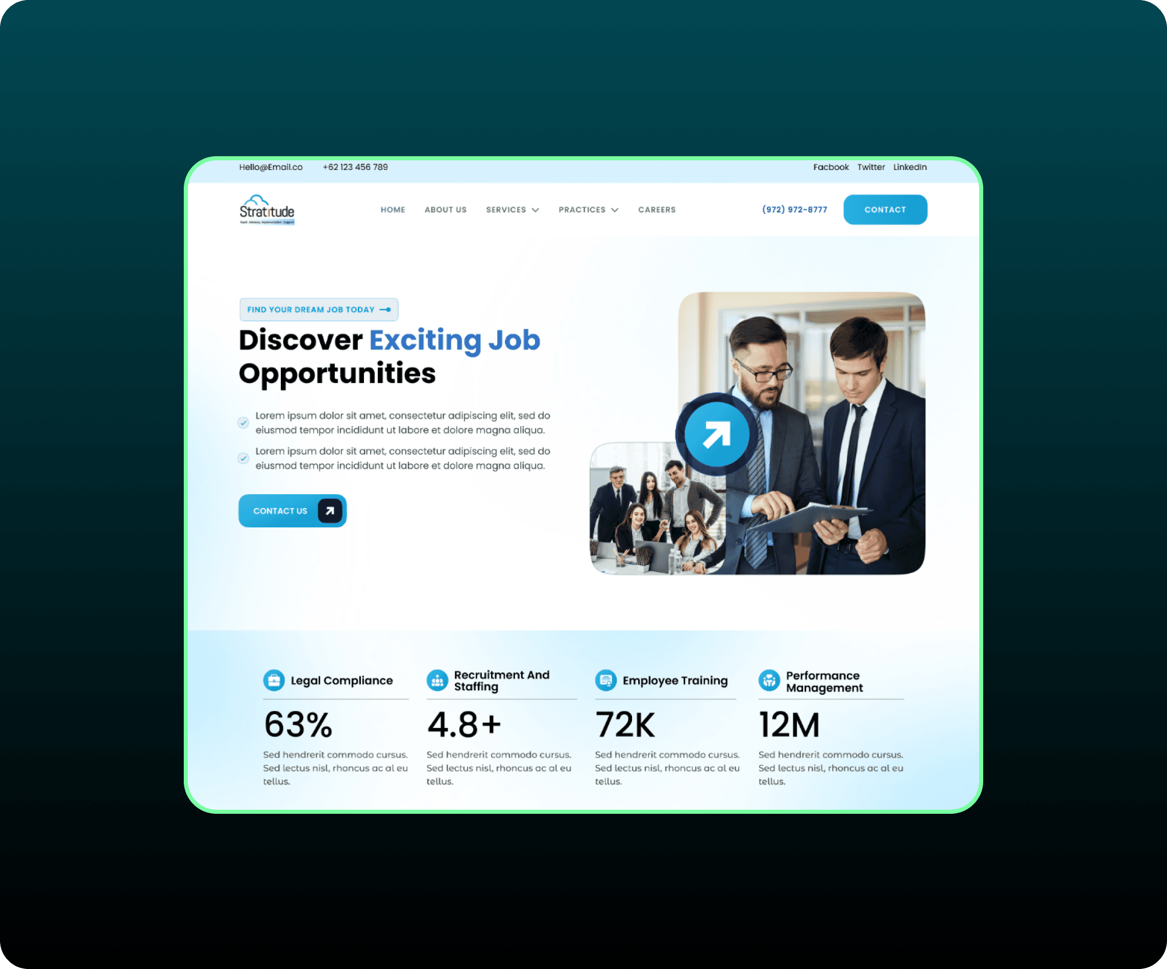
Revamping Our Digital Presence: A Website Redesign Journey
I redesigned our website to improve its look and feel, make it easier to use, and better reflect our brand. We analyzed the old design, set clear goals, created visual mockups, designed the website.